Laws of UX: Using Psychology to Design Better Products & Services
This book describes the fundamental rules of design that designers generally know from experience. The book allows readers to learn about what constitutes efficient design and the business value of design.

Referenced from Home: Laws of UX
UX/UI (user experience/user interface) is an important factor for a product. Someone may decide to buy or discard a product because of its design.
1. Jakob’s Law
Designs should include familiar elements and functions. People prefer familiar designs and forms. If a design feels unfamiliar, they are less likely to use the product.
Mercedes-Benz Power Seat Controls imitate the shape of the seat, helping users understand how to control it.
2. Fitts’s Law
The difficulty of clicking something is proportional to the distance and inversely proportional to the width. In other words, touch interfaces should be close enough and large enough.
Modern cars have integrated air conditioning systems and traditional physical buttons into monitors, making it difficult to click. Within the monitor, it is not easy to adhere to Fitts’s Law.
3. Miller’s Law
The average person can only keep 7 (plus or minus 2) items in their working memory. Therefore, you should divide the interface into 7 chunks.
Nike’s website classifies components into 7 chunks.
4. Hick’s Law
The time it takes to make a decision increases with the number and complexity of choices. Minimize and optimize the number of options. Too many options can overwhelm the user.
Apple’s Smart TV remote has a very simple and refined design.
5. Postel’s Law
Design for the broadest possible acceptance of variable user input.
An example of a bad interface is one that only shows an error message after the user has finished entering their password and clicked a button to submit it, indicating that the password doesn’t meet the requirements. Instead, it could provide real-time feedback below the text input field about the password’s validity.
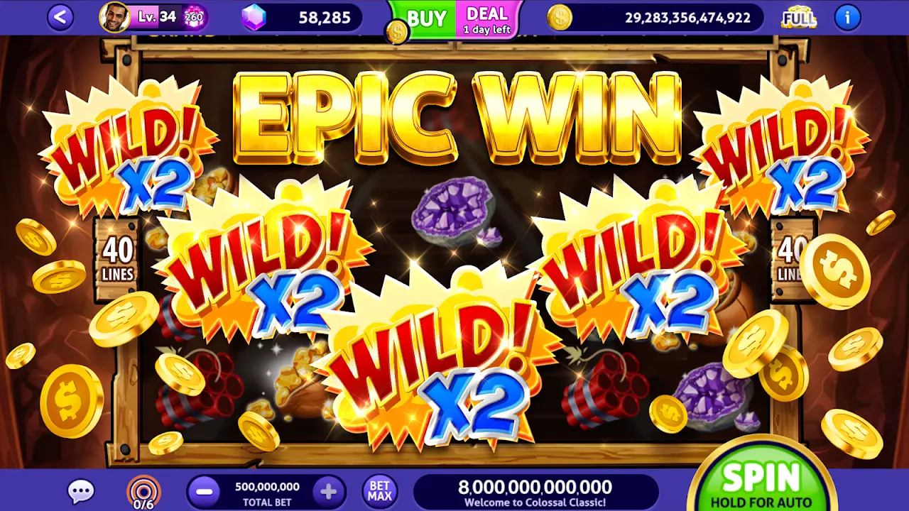
6. Peak-End Rule
People judge an experience largely based on how they felt at its peak and at its end, rather than the total sum or average of every moment of the experience.
The slot machine game app (Club Vegas) focuses on the moments when the user wins through exciting music and impressive visual effects.
7. Aesthetic-Usability Effect
Users often perceive aesthetically pleasing design as design that’s more usable.
Apple’s elegant and beautiful design has helped secure a competitive edge in the market.
8. Von Restorff Effect
Make important information or functions visually prominent. When emphasizing visual elements, limit the number to ensure that key items are not mistaken for advertisements. When highlighting specific elements, do not rely solely on color as this can exclude users with color blindness or low vision. Instead, use animations or size changes to draw attention.
9. Tesler’s Law
Every system retains a certain level of irreducible complexity, which must be preserved. Any complexity that designers and developers do not handle is passed on to the user, resulting in a poor user experience.
10. Doherty Threshold
Within 0.4 seconds! If a computer and a human interact within 0.4 seconds or less, productivity increases dramatically.
YouTube fills the loading blank page with animations and gray boxes until the content is downloaded. This helps users tolerate the waiting time more patiently without leaving the page, even if the loading time is over 0.4 seconds.